Click on graph for larger image.
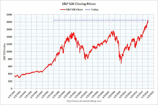
By request – following the huge market rally in 2013 – here are a couple of stock market graphs. The first graph shows the S&P 500 since 1990 (this excludes dividends).
The dashed line is the closing price today. The market was up 29.6% in 2013 plus dividends.
 The second graph (click on graph for larger image) is from Doug Short and shows the S&P 500 since the 2007 high …
Happy 2014 to all.