Given the constant chatter from the Obama administration and from teachers’ unions on the need to spend more for public education, let’s address the question “Is the US spending enough on education?”
I propose we look at the stats in graphical form starting with charts of population and total spending, culminating with education spending per child.
click on any chart for sharper image
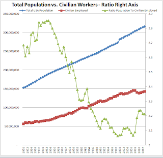
1. Population vs Civilian Employees

2. Budget Per Civilian Employee

Data is from White House OMB Historical Tables
3. US Population and Children Population

Data is from Childstats.Gov and the US Census Bureau Population Clock
4. Education Spending in Constant Dollars

Data is from National Center for Education Statistics
The above charts are from reader Tim Wallace who writes …
Hello Mish
Last week I saw a comment on one of your blogs regarding there would soon be one non-worker for every worker in the country. Here are some charts I put together that highlight the current trends.
1. Total Population vs. Civilian Workers – Ratio Right Axis — This is a chart of our country’s population by year, with the number of people employed in March of that year, starting in 1950. You can see that there is a significant growth in the ratio of people to workers early on, up until the mid 1960’s. This is mostly because of an explosion in the number of children in the USA in that time period, starting at 47.3 million in 1950 and surging to 69.7 million in 1964. The child population then flat lined for several years, decreasing as a percentage of the overall population. The ratio since the 1980’s mostly seems to be affected by recessions periods with increases in the early ’90’s and ’00’s. There has been a slight drop in the ratio the past two years, but nowhere near the number necessary to return us to the levels of the alleged “balanced budget” time period in the late ’90’s.
2. Budget Per Civilian Employed In Constant 2009/2010 Dollars — This chart shows the federal budget divided by the number of people employed, how many dollars it ends up being per person employed. Obviously a lot of tax dollars come from other sources, but it is still illuminating to see the huge increases under the current administration on a per worker basis. From $20,000 per worker in 2007 to around $28,000 now, an increase of $8,000 per, or about 40%. I don’t recall getting a raise that large. Yet somehow we cannot afford a measly 2-3% budget cut.
3. US Total Population and Children Population – Pct. Right Axis — The chart shows children as a percentage of the population plummeting from 1964 – where they peaked at over 36% to today where they are just 24% of the population. The number of children in ’64 was about 69.7 million, today up to 76.7 million, a growth of 7 million while the overall population grew 123.7 million! The real problem here is that a growing economy is always dependent on the growth of the upcoming population. We are in deep trouble here.
4. Number of Children and Per Child Spending On Education in Constant 2009-10 Dollars — I cannot understand how this spending, so absurdly high, is continually pointed out as too little to spend on education! In constant dollars we are spending 7 times the amount on education as the 1950’s – the generation of students that put the man on the moon, invented computers, the list goes on and on. At 1/7th the cost!
Hope these are informative.
Tim
Where Did the Money Go?
Where the money went should be intuitively obvious: Teachers’ salaries, teachers’ pensions, administration salaries, administration pensions, sports programs, sports staff, union maintenance crews, etc.
Please keep these charts in mind the next time someone says we need higher taxes “for the kids“.
Mike “Mish” Shedlock
http://globaleconomicanalysis.blogspot.com